Allright, do you still have energy? That was a lot of theory, but in this lesson, we’re going to look at a practical example by implementing what we’ve learned!
What We Build
In this practical example, we’ll be creating a range of diverse cards, each styled in a basic manner. Our goal is to make these cards interactive. To do so, we’ll devise a system where upon clicking a card, we add a CSS class to it. This class will signal that the card is in an ‘active’ state and will trigger a different, alternative style to be applied to it.
In order to keep the focus on one card at a time and make the user interface more intuitive, we have also decided that each click on a card should reset the state of all other cards. This means that when a new card is selected, all other cards will lose their ‘active’ state and return to their original styles, ensuring that only the most recently clicked card stands out.
Everything clear? Great! Let’s start with the basic layout!
The Layout
Here you see a few boxes that represent our cards. In Bricks, this is simply a .cards wrapper (Block) that contains several .card elements (Block) that have been styled with a global .card class. As you can see, nothing happens when you click on those cards with the mouse.
Now, we’re going to add our newly learned interactivity.
Set Up an Event Listener
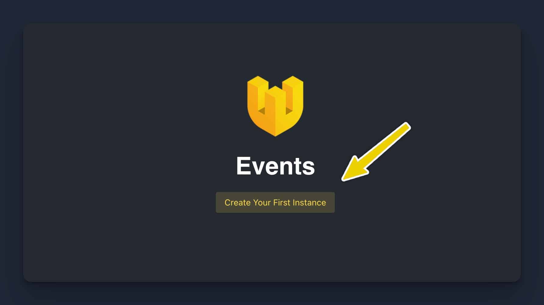
First, add a new Event Instance. This can be done by clicking on “Create Your First Instance” or the “Plus” icon, if you already have instances running. Ensure that you’re on the “Events” tab.
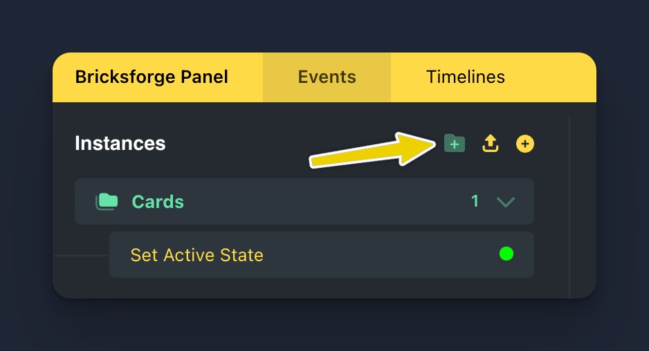
To maintain organization, it’s beneficial to use folders. For instance, we can create a new folder named “Cards” and move our new instance into it. Renaming the instance to “Set Active State” is optional, but it provides a clearer overview.
Now let’s consider what we have in mind. We want to wait for someone to click on such a card. So which event would we need here? Exactly! We need On Click. Since we don’t just want to consider the first card, but all, we choose “All Elements with this selector” and enter .card. This will take into account clicks for all elements on the page that have this class.
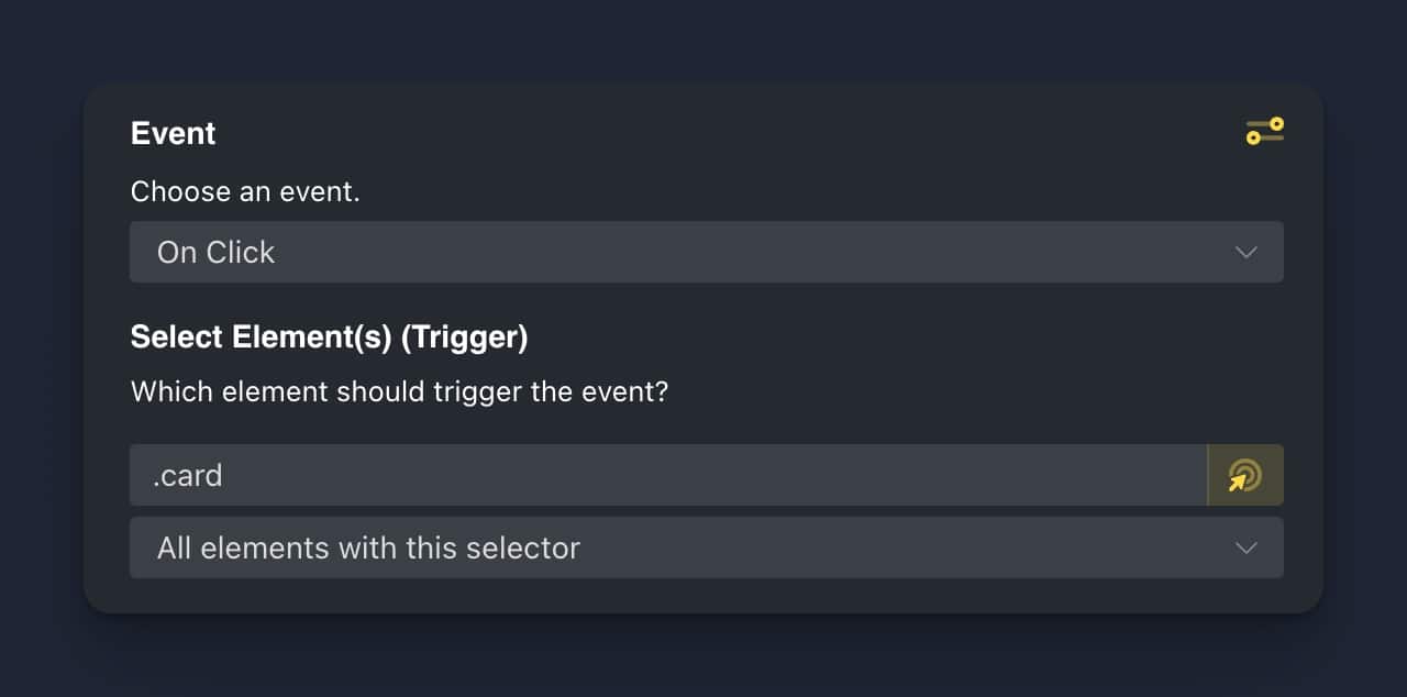
That’s all for the Event Settings.
Set Up An Action
What action do we need? Let’s think about it.
In our case, we want to add a CSS class to the clicked card. This implies a “Add Class” action. Additionally, we also want to ensure that all other cards lose their ‘active’ state when a new card is clicked. For this, we would need a “Remove Class” action applied to all other cards.
What should be the order of these actions? First, we should “Remove Class” from all cards, and then “Add Class” to the clicked card. This ensures that only the most recently clicked card is highlighted. Let’s do it.
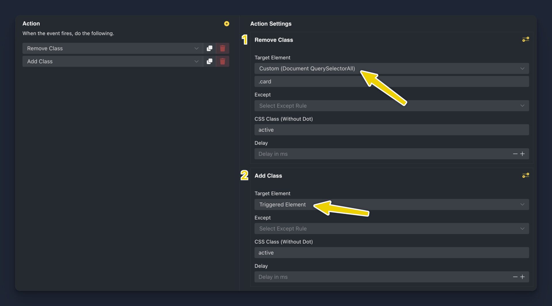
For the first action, “Remove Class”, we selected “Custom (Document QuerySelectorAll)” as the target element and inserted the class .card. This ensures that the ‘active’ class is removed from all cards. For the second action, “Add Class”, we selected “Triggered Element” as the target element. This refers to the specific card that was clicked, ensuring that the ‘active’ class is added only to that card. As a result, the clicked card is highlighted while the other cards revert to their original style.
Active state styles
Now that we have our actions set, we need to define what our ‘active’ class actually does. To do this, we’ll use Bricks “Custom CSS” to create a class .active that applies a different style to a card when added. This could include changing the background color, enlarging the card, or altering its border, among other things. Remember, this style will only be applied to a card when it is clicked, and will be removed when another card is selected.
In our example, we apply some basic styles on global class level.
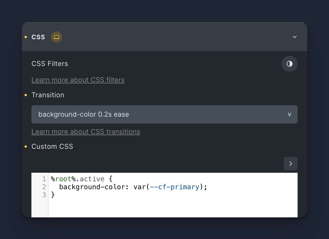
Here, we specified that if the .card element includes the .active CSS class, it should display a background-color of var(--cf-primary). This corresponds to the primary color of this website. Let’s give it a try!
Result
After saving the Bricksforge Panel, you will see the following result.
Go ahead and click on the cards!

Now, when clicking on any card, it changes its background color to the primary color of the website, indicating it’s in the ‘active’ state. Meanwhile, if there was a previously selected card, it returns to its original state. This way, our interactive card system ensures that only the most recently clicked card is highlighted at any given time.
Conclusion
That was a simple example on how to apply interactivity to your website elements using Event Listeners and Actions. It will help you to understand the processes correctly and apply them to your own projects.
The more you practice and experiment with different events & actions, the more sure you’ll feel about knowing which strategy fits each situation.